|
Guest Post - How to create a professional looking banner for your VPASP Store for free |
| Gareth Sales Monday, July 8, 2013 |
We often get asked about how to customize the standard VPASP templates and our answer is that you either need to have knowledge of HTML / CSS / Adobe programs or you need to pay a web designer to do it for you.
In today's post, a friend of mine is going to teach you how to use a free piece of software to create your own professional looking banners which you can use to customize your VPASP store.
I've followed this tutorial myself and had a great time learning how to use a great piece of software, over to you Mark....
Hi everyone, my name's Mark and I write a blog over on my website in the UK, Design Mark Graphics which teaches people how to use free open source graphics packages to create great graphics. Free open source software is a great choice for your business because you don't have to pay a load of money buying something that is overpowered for your needs, but it's just as capable when it comes to producing fabulous graphics for the web.
Today I'm going to show you how easy it is to design an eye-catching and professional-looking banner for your VP-ASP online store. Before we start, you'll need to download and install the software from GIMP's website by clicking the Download link and following the instructions there. It's not complicated but might take a little while because there's a lot packed in there. For personal reasons I use a different software version than the one from GIMP's own website, but don't worry if my screenshots look a tiny bit different to what you see - all the buttons are in the same place and everything works the same way.
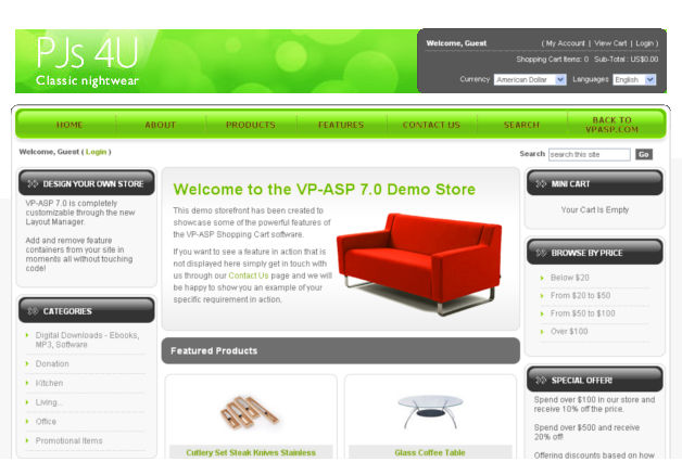
As I always do before delving into a tutorial, here's the end-product we're aiming to get out of this tutorial:

I'm going to assume more or less no knowledge of the software and illustrate each step as we go, to hopefully help newcomers to GIMP as much as possible. Let's get started.
Step 1 - Create the background layer
Open up GIMP and create a new document using Ctrl and N or File --> New from the menus. In the pop-up box, enter dimensions of 992 pixels for the width and 96 for the height. This will fit well into most VP ASP site templates. You can leave all the other settings as they are here. Click OK when you're done.

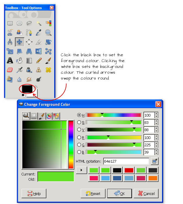
If you can't see the Toolbox panel already, press Ctrl and B to show it, then click the foreground colour box to open up the colour palette.
In the box that pops up, select a colour for your background from the colour mixer area. I've gone with a bright green hue here, #64e127, which you can enter the number for in the box directly if you want to match this guide exactly. Don't go for one that's too bold as it'll overpower the rest of your page and draw attention away from your actual products which is, after all, why your site exists. Click OK to set your foreground colour when you've found a suitable one you like.
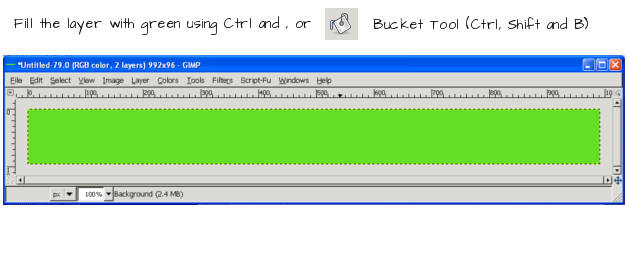
Fill your background layer with this colour by pressing Ctrl and the , (comma) key, by clicking and dragging the colour from the toolbox into the window, or by using the Bucket Fill (Ctrl, Shift and B) tool; whichever you prefer.
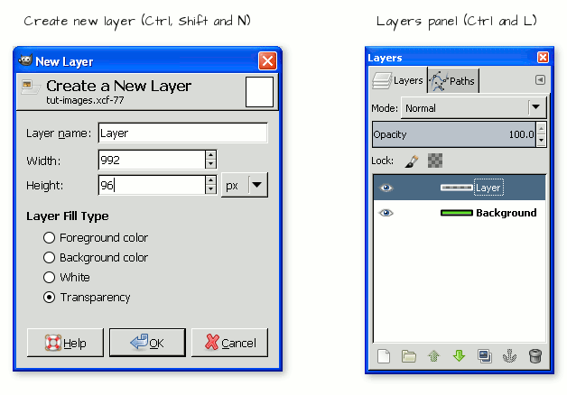
Now, this colour is fine but, for that professional touch, we'll add a subtle highlight and shadow which will set off our company logo just nicely. Create a new layer by pressing Ctrl, Shift and N, or by selection Layer --> New Layer in the menu. select Transparency for the Layer Fill Type, if it's not already selected for you, and click OK. You'll see this new layer sitting above your background in the Layers panel (Ctrl and L).
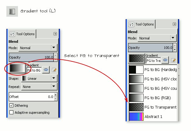
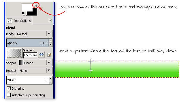
Firstly, reset our fore- and background colours to black and white by pressing the D key or by clicking the little black and white squares next to where they sit in the toolbox.

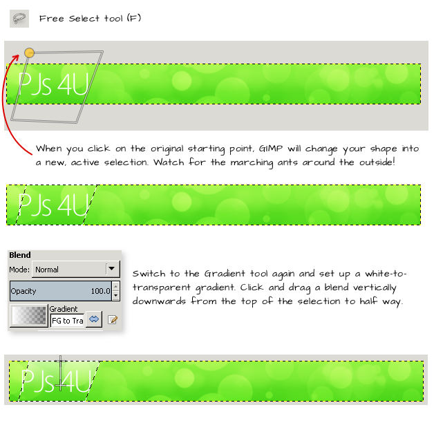
Activate the gradient tool with the L key and look for the Tool Options area which should, by default, appear in the lower portion of the Toolbox. If you can't see it, click Window --> Toolbox to bring it up. Click on the black and white picture next to the Gradient option and select FG to Transparent.
Click and drag a short gradient from the bottom of the layer to about half way up. Release the mouse button to make GIMP add the gradient. Tip: hold down the Ctrl key while you do this to easily get a gradient that goes exactly vertical.
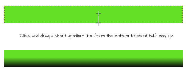
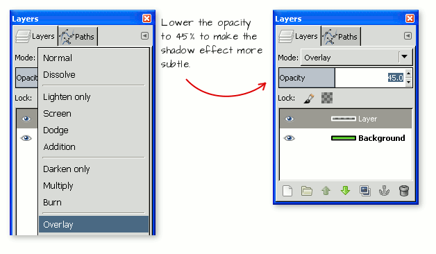
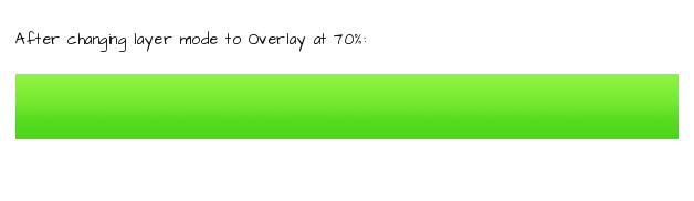
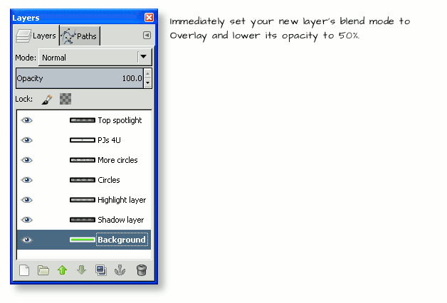
Over in the Layers panel, find the Blend Mode dropdown box and select the Overlay option, then use the Opacity slider to reduce this layer's opacity to about 45%. This will make the effect much more subtle while still keeping it visible.
All of which should leave you with something resembling the below image.

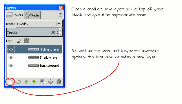
Create another new layer at the top of your stack, and repeat these steps to create a white-to-transparent gradient going from the top of the layer to about halfway down. You can either swap the foreground and background colours around using the curly arrows in the toolbox area, or by pressing the X key. Alternatively you can select a BG to transparent gradient setting from the Gradient tool's options area if you'd rather do it that way.
Use a layer blend mode of Overlay again, but this time set an opacity for the layer which is much higher: 70, or maybe even 80%.
All right, that's a good start; time to add some more detail.
Step 2 - Add more background elements
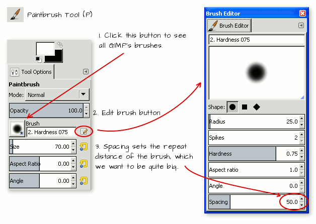
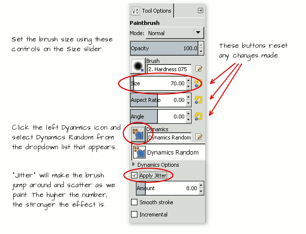
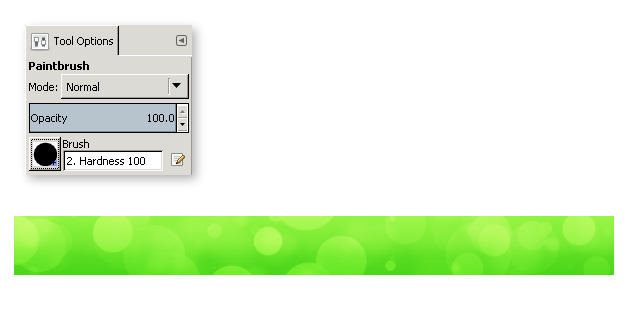
Pick up the Brush tool with the P key or using the tool's icon in the toolbox. With a foreground colour of white, create another transparent layer which will appear at the top of the layer stack. In the tool options panel, click on the brush shape and select a circular brush with a Hardness of 75. set the Size to 70 pixels, then click the Edit Brush icon to the right of this area to bring up the brush editor. The only thing we need to change here is the Spacing setting, which you should alter to a value of around 50. Doing this will spread our circles out to give the spotted effect we're after, otherwise they'll be too close together to be distinct.
In the Dynamics area, click on the left-hand icon and, from the list that appears, choose Dynamics Random. Lower down, tick the Apply Jitter option and set a value in the box of something like 7 or 8.
Back on the canvas, click once on the left-hand side of the image (you can even go off-canvas with this first click), hold the Shift key down and click again somewhere on the right-hand side of the window.
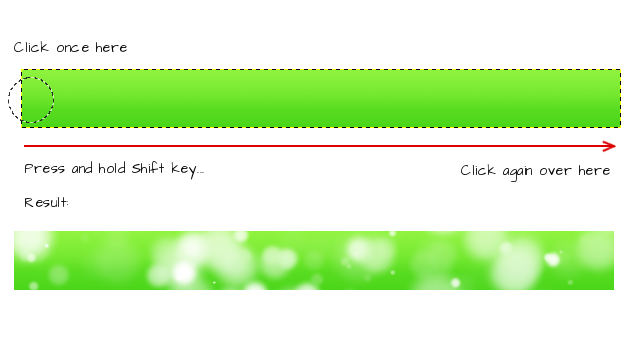
Excellent! Can you see how our brush settings have made the job of producing these scattered circles of varying sizes really easy? Now, like before, set this layer's mode to Overlay, and reduce the opacity to about 40%.
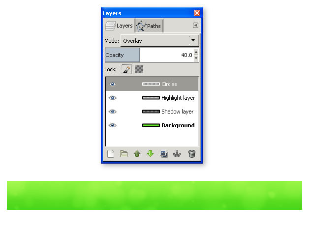
Change your brush to one with a Hardness of 100, but keep all the other settings the same as before. Create a new layer above this one and paint another scatter of white circles on it. Apply a layer blend mode of Overlay once again, with an opacity of 60-70% on this layer.
Great work, that's the background finished, now it's time to add our logo to the banner and finish the job.
Step 3 - Add your logo and company name
It's possible you've already got a logo image that you've either made or had designed for you, ready to be introduced. At the very least, we should put some text onto the banner with the website or business's name. I'll take the easy route here and show you how to add some simple wording to the banner so website visitors know they're in the right place.
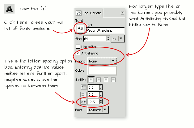
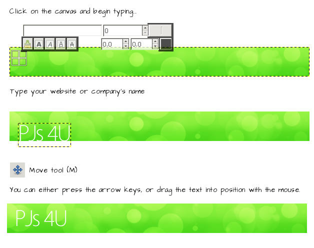
So, activate the Text tool with the T key and move down to the Tool options area to see the current font, size, colour and a few other settings that we can, in the main, ignore. The font I've used here is a freely downloadable one (of course) called Vegur, and I've selected the Ultra-Light variation for a stylish, narrow look that will add a little bit more classiness to our banner. This part is largely down to personal preference, but here are the settings I've used and if you do the same your result should look similar.
Move the pointer over to the canvas, and click on it to start typing your text. Type in your company's name and, if it's appearing in the wrong place, use the Move tool to adjust where it sits so we can see everything.
Just one more nifty thing we can do here to try and push the company name into the subconscious of the site's visitors and make them remember it. Let's add a subtle spotlight to the text on a new layer right at the top of the stack. Create it now, then change its blend mode to (what else) Overlay and lower the opacity to 50% before we start working on it.
Activate the Free select (sometimes called the Lassoo) tool with the F key. Click on four points of a parallelogram shape, using the space around your canvas to do it. When you click the last one, position it where the first one went - GIMP will indicate this with a circle and close the loop, creating a selection. Then get your gradient tool out again and draw another white-to-transparent gradient inside this selection to give us our spotlight.
Finally, let's get rid of that selection shape by pressing Ctrl, Shift and A, or select --> None in the menus, so we can see the fruits of our labour. If you want or need to, add any other text, logos or imagery you feel is necessary, but try to keep it to a minimum; again, we want to focus visitors' attention on the product area rather than an overly-busy header banner. I've re-sized my original header text here so I can fit a tag line underneath. All of which is very easy to do, at this point.

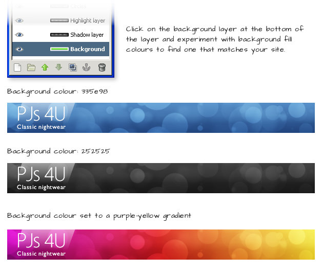
Don't like the colour? Doesn't fit in with your site's scheme? Easy - just click on your bottom layer to select it again, then re-fill it with a different colour from GIMP's palette. Because all the other layers are set to Overlay, you can leave everything else as it is and all the effects will still work. It even works on dark grey backgrounds and multi-colour gradients. It's entirely up to you - the choices are endless.
Step 4 - Save the banner as a JPG and upload it to your site
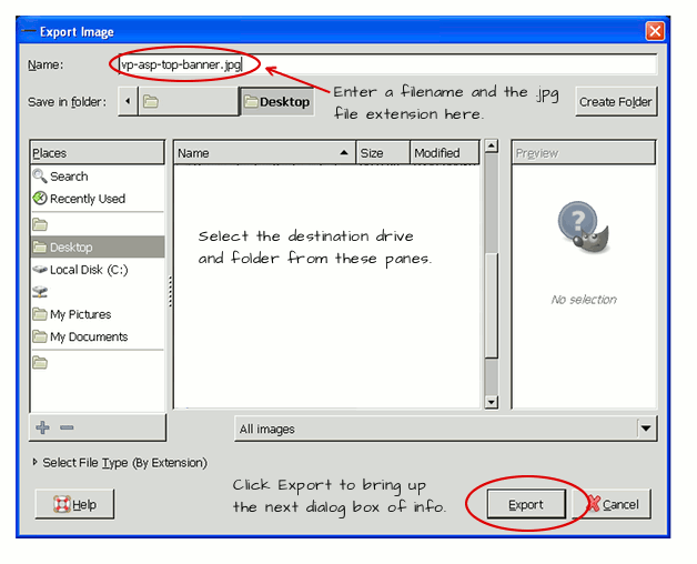
Lovely. The final job is to export this banner so we can introduce it to the site and see it live. To do this, press Ctrl, Shift and E on the keyboard or use File --> Export in the menus. In the dialog box that pops up, locate the folder you want to save the image to on your computer, give it a filename and remember to add .JPG at the end of it so GIMP knows what type of file we're after. Click __ when you're ready.
Now, something to bear in mind is that there are high-quality JPGs and low-quality JPGs on the internet. High-quality image files are also larger files, which means they take longer to load when people view a site. GIMP gives us the flexibility to decide how high we want to set the quality of our exported file - it's the big slider at the top of the next box that appears.
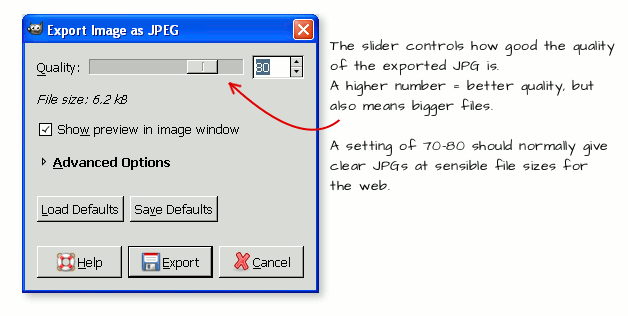
To get the balance right is not an exact science, but as a general rule, a quality setting of about 70-80 will keep the file size down without compromising on the detail you can see in the resulting image. Leave all the other settings at their default values and click Export to create your final JPG. It should come out at under 15kb in size, which is tiny and won't slow your site down even slightly.
Step 5 - Upload the image to your site
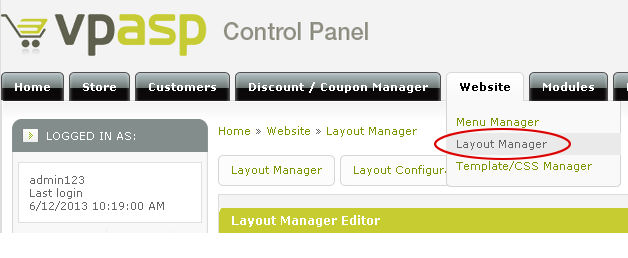
Now to get this banner onto your site where everyone can see it. Log into your VP ASP control panel and, from the top menu, select Website --> Layout Manager.
On the next screen, locate the box labelled Header Logo Container, and click the Upload Image link. Use the "Choose File" button in the pop-up box that appears to locate your JPG, and upload it to whatever folder you normally save your site's images to. Don't forget to set the dimensions of the banner in the Header Logo Container box to the right numbers, otherwise it might appear distorted.
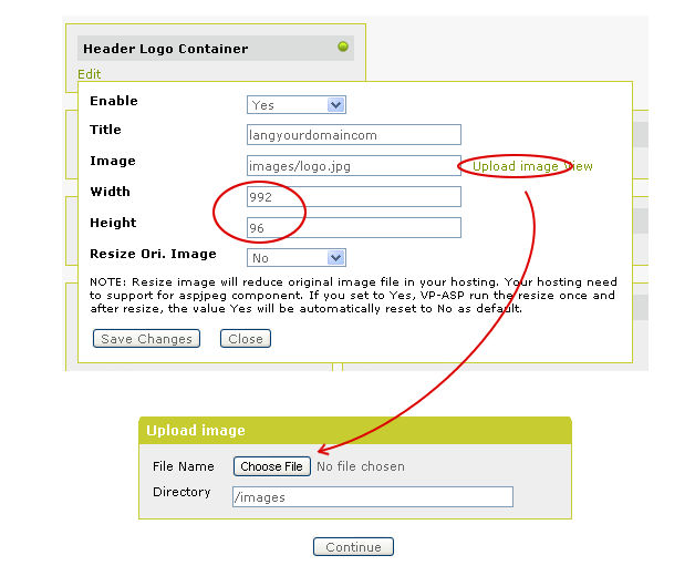
Click Save Changes and you're done - the next time you load your VP ASP store your header should appear at the top in all its glory. You might need to make some other adjustments if you've got a background image loaded or the colour scheme needs to match, which can be done either through the Layout Manager or the Template/CSS Manager window. layout.css in the Template Manager is often your first port of call if this is the case.
So there you have it, a step-by-step guide to making your own online store's banner without having to pay for an expensive design software package. I hope you've found this tutorial useful, don't forget that VP ASP offer great guides, support forums and Helpdesk if you need further assistance with managing your site. Have fun and be creative!

Comments
Leave a comment
*Please enter the code shown into the box below